Do you want to track the spread of coronavirus in the UK? The below dashboard, based on UK govt data, enables monitoring of coronavirus trends in the UK. (Note: if the below covid dashboards are out of date, check the UK Govt link. The data in this page can’t update until the data is available on the govt page.)
Trends of Coronavirus cases in the UK
The dashboard below monitors coronavirus deaths in the UK. Or, to be more precise, people who had had a positive test result for COVID-19 in the 28 days before the date of death.
Trends of Coronavirus deaths in the UK
Check the other dashboard showing local authority level view of coronavirus cases in England. The data at this level of granularity is only available for England.
The post on coronavirus cases also includes the 7 day rolling average of coronavirus split by English regions.
This was first built in mid-March. Since then the available data has changed and expanded. Consequently, the dashboard content is also evolving.
The current version of the dashboard gives a high-level view of the UK and each constituent nation. There are 4 main dashboard sections.
The coronavirus summary tables and important dates

The data validity and the last update date of the dashboard is here.
Also there is a table giving an overview of cases and deaths for the entire UK. It also includes a breakdown of coronavirus cases for each of the constituent countries of the UK.
This country breakdown serves another purpose. Click on a country name (or CTRL-click for multi-select) to filter the below charts for that country.
Cumulative Coronavirus Cases and Deaths
For the chosen country it shows the trends of new cases and deaths. The default view shows the entire UK.

Daily New Coronavirus Cases
For the chosen country it shows the daily new cases. The default view shows new cases for all of the UK.

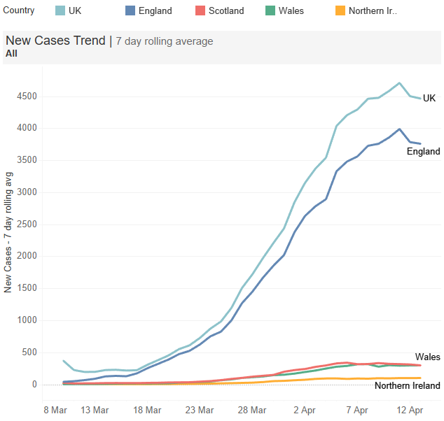
New Cases Trend – monitoring the coronavirus curve
This is a 7-day rolling average of daily new cases. Taking a rolling average smooths out any daily data issues giving a smoother view into the trend. For example one day almost no data was provided by Wales and the following day there was an exceptionally high number of cases. The rolling average somewhat removes that type of data issue.
The UK and all of the member countries are on this chart. Filtering for a member country using the table in (1) also applies to here. Therefore it’s simple to see the curve only for Scotland, for example, rather than skewing the axis with the inclusion of the UK.

This was built in Tableau. This enables the same dashboard to scale for a mobile device and desktop.
Updating the Coronavirus Data
The data appears to be released between 1800 and 1900 UK time each day. In addition, updating is a manual process. Therefore I can’t promise the dashboard will update every day.

Hi,
these are very helpful charts. How complex would it be to plot a a representation in Tableau just like the FT is doing in his corona virus report at this link https://www.ft.com/coronavirus-latest ?? Curios to compare with other countries and time lagging in an effective way.
To recreate the time lag in Tableau would be straightforward should you have the data. Note, when comparing between countries the data reliability is increasingly questionable. In my opinion it’s very much comparing apples and oranges. From people I know personally, who have probably been infected and recovered without being tested, I believe the UK numbers are a major understatement. Some countries have better data, others far worse. It depends on the testing.