This article demonstrates how to build a panel chart in Tableau, using 3 examples of increasing complexity.
- First, build a simple panel chart showing a heatmap.
- Next, increase the difficulty and build area charts within the panel chart.
- Finally, more complicated again, build a Tableau panel chart containing treemaps within each panel.
About the Panel Chart
A panel chart (also known as a trellis chart / small multiple chart / grid chart) has been around for at least 150 years! No idea why it has so many names, there has been plenty of time to choose one and stick with it.
Taken from Wikipedia, this is one of the earliest examples of this chart type, created around 1870. It has treemaps within a panel chart.

Anyway, this post isn’t a data visualisation history lesson…however, the first reference I found to this chart type in the Tableau world was back in 2011 when the now famous Andy Cotgreave (famous in the Tableau world at least) wrote about these. Since then, there are numerous articles dotted around the internet demonstrating how to make a panel chart.
(And I did make an effort at replicating it in Tableau – it’s not quite the same as the original.)
Is a panel chart useful in the professional environment?
Panel charts do have uses in the professional environment. Admittedly, I haven’t used it often, but on one high profile project it was the perfect solution. For an Employee Conduct project, we used a panel chart to show if an employee was breaching any of the conduct guidelines.
There were about 15 employee conduct guidelines and these were laid out in a grid showing the stats for each conduct factor, using colour to indicate whether there were any breaches. One view provided all the Conduct information needed for appraisals.
How to build a panel chart in Tableau
Now we have ascertained there is a place in the commercial environment for a panel chart, the next question is how to build one in Tableau.
This article will demonstrate how to build a panel chart, starting from a simple chart and moving up to more complex examples. This will include replicating, albeit with different data, the above panel chart with the treemaps.
The basis for these charts are calculating the Rows and Columns, the X and Y values. Obviously one of the reasons they are sometimes known as a grid chart is because the data is laid out in a grid.
Therefore, the first task is to create the grid.
For this use table calculations. Use the INDEX and SIZE functions.
These functions use the data provided to create the grid. For example with 25 items it would automatically create a 5×5 grid. Use a filter to leave 16 items remaining and the grid would alter to become 4×4.
How to build the grid of the grid chart
The columns, or X axis, formula is:
(INDEX()-1)%(INT(SQRT(SIZE())))
The rows, or Y axis, formula is:
INT((INDEX()-1)/INT(SQRT(SIZE())))
However large and complex the grid, these calculations are consistent. The “Compute Using” is the only thing to change when using different data.
Create a simple dynamic heat map grid chart
In the first example create a simple heat map showing Sales per Country and using colour to indicate whether profitable.
Put the X pill to Columns and Y to Rows. Place Country on the Detail shelf.
Both the X and Y pills have to be Discrete – the blue colour pill.
The number of countries will size the grid. Therefore, set the Compute Using of both the X and Y pills to Country.
Make sure the Marks are a Square type and put Country to Label. Also put the SUM([Sales]) to Label, meaning the Country name and total sales are visible in the square.
To finish, add some colour to indicate the profitability. Drag SUM([Profit]) to the Colour shelf and set the colours as wanted.
I also put a white border around each cell using the Format option, to better separate the grid.

Create line charts within a panel chart
To increase the complexity, next embed line charts within each panel of the grid.
As before, start by putting X on Columns and Y on Rows and making sure both pills are discrete (blue). Also put the Country on the Detail shelf and set the Compute Using to Country for both X and Y.
Next to put the charts within the panels.
Put the Year of Order Date to columns, to the right of the X pill. It doesn’t matter if the Year pill is discrete or continuous (green). Next, put the SUM([Sales]) on Rows, to the right of the Y pill. This should be green, continuous.
Now you should have line charts within each panel. If not, set the mark type to be Line – or Area as I have in the example.
To finish add some labels identifying the country. Or get more complex as Chris Love did in a similar post.

Build treemaps within the panels of the panel chart
Back to the early examples of this chart type, this time to replicate the work from 1870. Although this time with different data – they didn’t provide nice csv files of raw data back in the 19th Century unfortunately.
Therefore, for this example of treemaps in the grid chart, use a Superstore data source. This time using the US Superstore data as it contains the US states, the same as the 1870 panel chart.
For this example use Ship Mode, each panel in the grid will represent a US state and show the percentage of sales by ship mode.
Creating this chart is a big increase in level of difficulty. The X and Y settings are not as simple as the previous examples.
Starting from the beginning, create a simple treemap with Ship Mode and Sales. Click those fields and Show Me. (Copy the image if Show Me doesn’t deliver what is expected.)

Turn this into a panel chart using the X to columns and Y to Rows and setting both to Discrete.
Each panel should each represent a state, so put the State on the Detail shelf and set the Compute Using of X and Y to State.

Now the view will be starting to take shape. However it won’t yet be what we’re trying to do. The sales in each state differ hugely, so sizing by Sales renders many states too small.
To compare the proportions we need to look at the % of sales by ship mode. But more on that later.

Another problem are the states. Not all states have all ship modes. This means a state can be split between more than one panel – which clearly isn’t wanted.
Zooming in on one panel, where X=3 and Y=2, there are 4 states in the same panel.

Reverting to a simple table is the standard way to get Table Calculation settings as needed.
Unfortunately, there is no way to convert a panel chart to a simple flat table. Instead, take out the sales and put the name of the state in each panel.
Keeping the ship mode, we should have the name of only one state appearing in each panel for each ship mode.
For example, if there are 4 ship modes for the state, the name should appear 4 times in the same panel. If there are 2 ship modes the name would appear twice, etc.
Set the Marks to Text, displaying the state name.
When the panel framework is properly set up, each state has its own panel.

See where X=3 and Y=2 only Maine appears with its one ship mode.
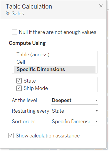
To create this, the settings for X and Y should compute using both State and Ship Mode, and be At The Level of State.

Make each panel in the panel chart the same size
Earlier I wrote about looking at the proportion of sales instead of the absolute number. This puts the same total values in each panel (100%) so each state will take the same amount of room in the panel.
This proportion of sales is a simple % of Total calculation:
[% Sales]: SUM([Sales])/WINDOW_SUM(SUM([Sales]))
Add the treemaps to the panels
Put the new [% Sales] pill to Size and change the Marks to Square.
Now it should resemble a treemap in each panel in the grid.
But to make each treemap fill the panel there’s one more thing to do; alter the Compute Using settings of [% Sales].
The total [% Sales] should equal 100% for each state.
Therefore, alter the Compute Using settings of [% Sales] as follows:
Finally this is showing proportioned treemaps in each panel.

Apart from tidying, by hiding X & Y headers and tooltips, there is one other thing to do:
Add a Label to each panel in the panel chart
Notice sometimes the state name appears multiple times in a panel? I prefer it only appears once.
The state name should also appear in the largest square of each panel.
We could do this with a complex calculation.
But the easiest option is to use the built in Label options.
With State on the Label shelf:

Set the mark labels to show on Min/Max, at the Cell scope, using the [% Sales] field and only show the maximum value.
As I’m hosting this on a blog, with only a small amount of dashboard screen real estate, I use the abbreviated state name. This data blends in from a separate data source.
If all has worked as expected your final panel chart with treemaps should appear like this:

Below is a workbook containing all of the panel chart examples. Feel free to download and play with it as you wish!
Hi — Thank you for your tutorial; it is exactly what I need!
The level of complexity to do this in Tableau is appalling